November 14th might seem like any other day of the week but, after a quick Google Search, to my surprise, I found out that it’s actually home to a variety of different ‘celebrations’. These include Operating Room Nurse Day, World Diabetes Day, and arguably the most important, Spicy Guacamole Day (who isn’t going to go home from work and make the most of that?). One thing that doesn’t come around every year though, is a (long overdue) update to LinkedIn Campaign Manager (it’s advertising platform) and the promise of a new Objective-Based Advertising UI.
I’ll be the first to say that the old LinkedIn Campaign Manager UI was a pain from start to finish. Its unintuitive campaign management and unexplained error messages caused headache after headache. The simplest of tasks became arduous and a nightmare for b2b marketers, especially when it came to managing multiple campaigns. But, from November 14th there’s a new kid in town and it’s called Objective-Based Advertising. Will it bring the changes that b2b marketers deserve?
Out with the old and in with the blue
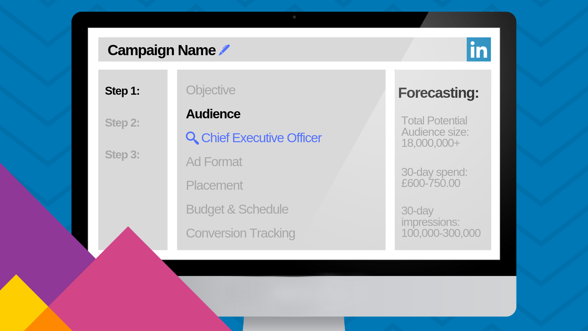
LinkedIn has redesigned the way campaigns are made from start to finish so that it’s easier to create and measure their impact. The creation process has now been broken down into three steps with lots of new features along the way: Set up a campaign, Set up ads and Review and Finish.
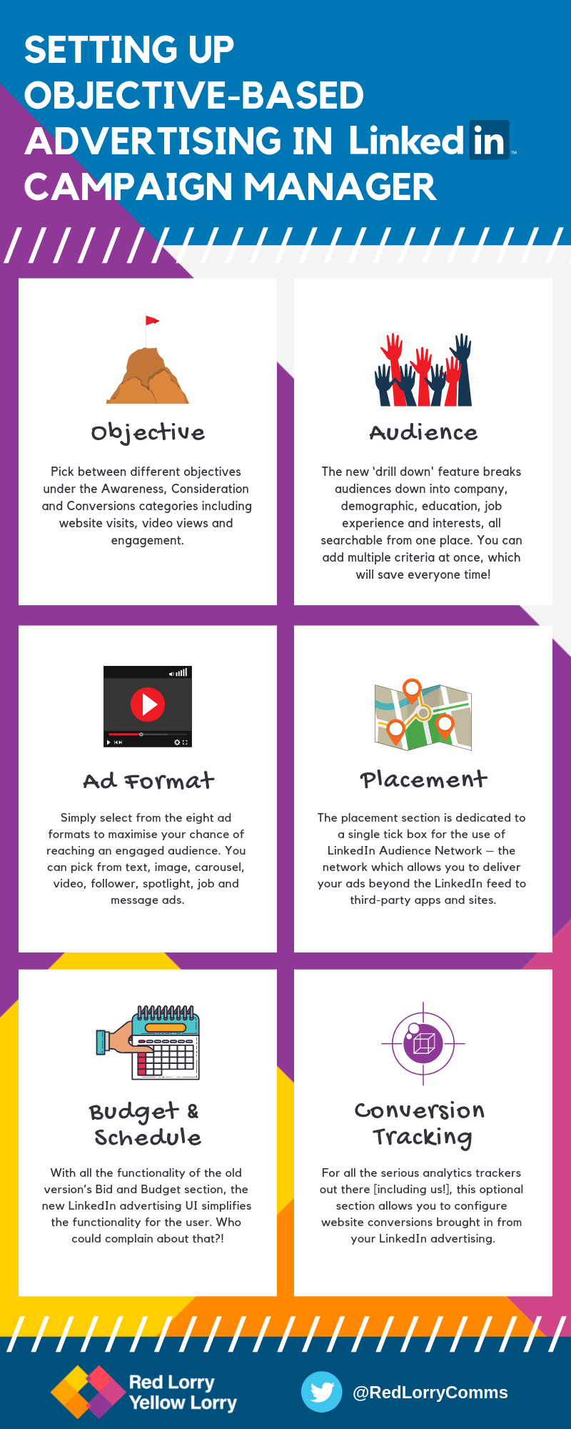
The setting up of a campaign has been broken down into six sections to make the process clear for users of any level:
- Objective
Pick between different objectives under the Awareness, Consideration and Conversions categories including website visits, video views and engagement. From different screenshots released by LinkedIn, we have seen that many other objectives are unavailable at this stage, including brand awareness, website conversions, job applicants and talent leads.
- Audience
LinkedIn’s targeting criteria has always been the best for b2b marketers and that hasn’t changed. A new addition is the ‘drill down feature’ which breaks the audience down into company, demographics, education, job experience and interests, all searchable from one place. You can also add multiple criteria at once, which will save everyone time! And, if you know the job title or company you are looking for, the process of finding the right audience becomes much easier.
- Ad Format
LinkedIn Campaign Manager recently added lots of different ad formats – native video, for example – which have all been brought together to make it easier for you to choose which one you want. Simply select from the eight ad formats to maximise your chance of an engaged audience. You can pick from text, image, carousel, video, follower, spotlight, job and message ads.
- Placement
The placement section of LinkedIn Campaign Manager is now dedicated to a single tick box (which seems redundant) for the use of LinkedIn Audience Network – the network which allows you to deliver your ads beyond the LinkedIn feed to third-party apps and sites.
- Budget & Schedule
With all the functionality of the old version’s Bid and Budget section, the new LinkedIn advertising UI simplifies the functionality for the user. Who could complain about that?!
- Conversion Tracking
For all the serious analytics trackers out there [including us!], this optional section allows you to configure website conversions brought in from your LinkedIn advertising.
The new UI has also brought forward some much-needed features which have been present on other ad platforms for years, including live ad preview and a forecasting panel which shows the potential number of LinkedIn audience members, estimated spend, impressions click-through rates and clicks over a set period. We haven’t tested it yet, but it should make predicting success (or not) much easier for marketers.
LinkedIn Campaign Manager: the hands-on scoop
Eager to test it out for myself, I sat down to see first-hand how the new LinkedIn Campaign Manager held up compared to its underwhelming predecessor. Objective-Based Advertising, a step forward for the platform, has been the go-to for its competitors like Google and Twitter for years (Twitter has had objective based marketing since 2015). As it’s the first stage beta for the new UI, it makes you wonder what they have been doing for the last three years while other ad platforms have progressed and adapted? In a recent blog post by LinkedIn, the company said that the full overhaul can be expected in mid-2019, so there may be lots more innovations to come. Lets hope so!
The first thing to note when it comes to LinkedIn Campaign Manager is that accounts, campaign groups, campaigns and analytics are still the same and the major cracks remain, like not being able to filter by date added. If you stop and start as you build campaigns (as often happens) it’s still easy to lose track of where you are. However, the new campaign creation process looks very different. The six sub-sections of “Set up Campaign” have a much cleaner look compared to the overcrowded appearance of the old version.
Targeting audiences now feels much easier to navigate. “Audience” has now been equipped with a new drill-down feature which, although just a search bar, has proved to be quite useful in finding specific criteria to match your chosen demographic. Instead of clicking through many sub-sections of potential characteristics, the drill-down feature will show what you’re looking for, and offer similar suggestions to go with it. The only problem with it – which became immediately clear – is the fact that you can’t target by job title AND function/seniority. In the past, this was something I had done quite a lot, for example, when targeting people who were in the marketing function but who were also directors. This got around the issue of people using variants of the same job title, like CMO or Chief Marketing Officer. This being said, you can target by function and seniority, which minimises the chance of people falling through the gaps. LinkedIn Group targeting has also improved slightly by showing the total number of people within the group (the bare minimum we’d expect really)!

Suggested Post
Social responsibility of business – should brands use social issues in PR?
A survey earlier this year found that two-thirds (66 percent) of U.S. internet users want brands to take a stand on social and political issues...
Read MorePicking your chosen ad format has also become a lot simpler, with a grid of all the different types and accompanying graphics. The bad news is the theme of sacrificing a good feature for a not so good one continues. Photos showing what the ads looks like before you select them have now gone, and though experienced LinkedIn Ad users will know which format the graphics represent, people new to the platform may not.
The LinkedIn Audience Network opt-in has now been moved into its own section called “Placement”, while the Audience Expansion feature (displaying ads to a similar demographic) remains in “Audience”. I don’t have a problem with this but do wonder whether it’s necessary? On the old version of the LinkedIn Campaign Manager, I thought this was done pretty well, showing as two tick boxes in the Audience section. The only benefit I can see from this is that it will minimise the chances of people getting confused between the two, fixing a problem which I’m not sure existed.
Moving on, one of the most important parts of running a successful advertising campaign on LinkedIn is the “Budget and Schedule”. This section looks a little cleaner than the old version, but its core functionality remains the same. There are two small differences to note. The first is having the ability to chose your budget allocation between daily, total, or both daily and total together. It’s important to know that automated bidding only works when using a daily budget, or daily and total budget together. The second difference is new functionality that allows you to maximise your chance for clicks, impressions or conversions.

As previously mentioned, the final aspect of setting up a campaign is the optional “Conversion Tracking” feature. Like the old version, you can add conversions which you’ve previously set up, or create a new one. When creating a new conversion, unlike Google Ads, there is no CPA to include. Instead, LinkedIn has a field called “Estimate how much the conversion is worth to your business to measure return on ad spend“. This seems like a pretty useless field, not providing any tangible or beneficial markers to promote a conversion.
The next stage of the campaign creation process is “Setting up the Ads” and LinkedIn, like before gives you two options: Create New Ad or Browse Existing Content (depending on the ad type you select). The most notable part of this step is that, finally, LinkedIn has added previews so you can see what ads will look like on desktop and mobile. Before you cheer though, LinkedIn has one final punch in the stomach to dish out, and it’s a good’un. Once you have selected or created the ad you want to use, you can no longer delete it from your campaign. The delete button on the ad summary page won’t help you either. If you click that, you will lose all your progress and the whole campaign will be lost. What a barrel of laughs!
Conclusion: to bid or not to bid?
In a hyper-content driven world which has overflowed into the b2b sector, advertising is a vital day-to-day tool for so many companies, large and small. The LinkedIn Campaign Manager has always been my least favourite ad platform, with its poorly-thought-out and lack of a user-friendly interface, but I had high hopes for the new Objective Based Marketing UI.
It certainly is a step in the right direction with a few redeemable new features like ad previews and the forecasting panel, but a lot of cracks still remain. One thing I can say it has definitely succeeded in improving is the appearance. It now has a clean and simple-to-use interface which is visually appealing to the user. But, despite the positives, only one phrase comes to mind when trying to describe it, and it involves polish and something that has no place being polished.
If you are looking at advertising and content marketing options for your business, drop us a message today and find out how the lorries can help you: hello@rlyl.com.

